We’ve finished a font 300 years later
Client: Molen de Ster
Industry: Events, Location
Assignment: Rebrand, Logo, Identity, Typography, Poster Campaign
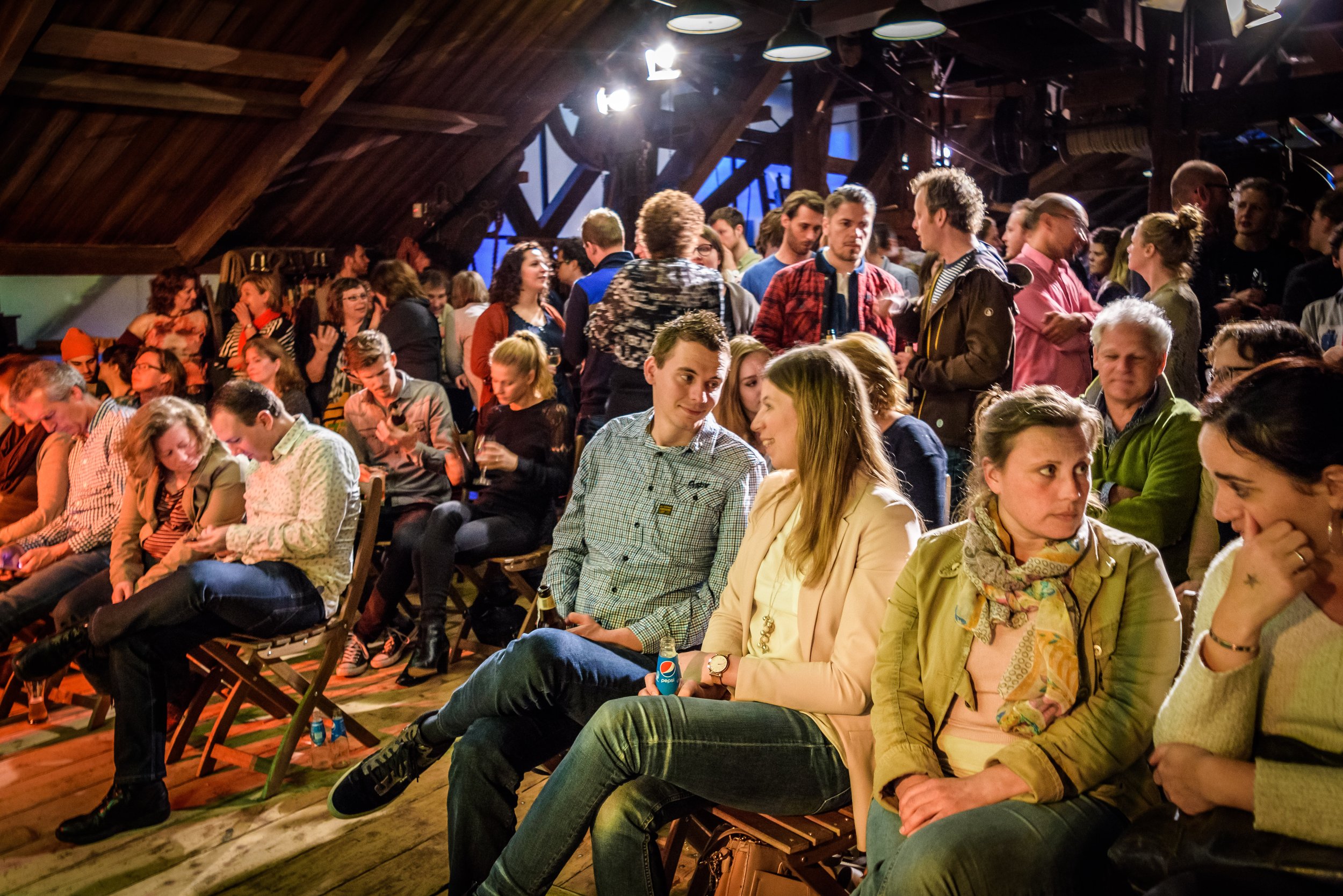
Molen de Ster was a sawmill from 1739 to 1980. Now it is an event venue for intimate performances in a unique location. Based on the existing six letters, we completed the typography set. Armed with this coproduced font we made the rest of the logo and designed a poster campaign. Milling was a laborious process. Working with your hands. The texture of wood grooved in your fingers. That's why all posters are screen printed. One by one. Real labor. To honor this heritage we’ve inserted a wood grain pattern in each design. The posters link the ancient sawmill to the hip, worldly and modern artists who now perform their music there.


Marloes Stofferis
Molen de Ster
Programmeur
“It perfectly combines the past and future of the mill.”
Client
Molen de Ster
Worth mentioning
Photohraphy by Nick Chesnaye
Questions about this project?
Ask Sjoerd
Sjoerd Wenting
Founder and art-director
Revolte Studio


