This brand’s got teeth.
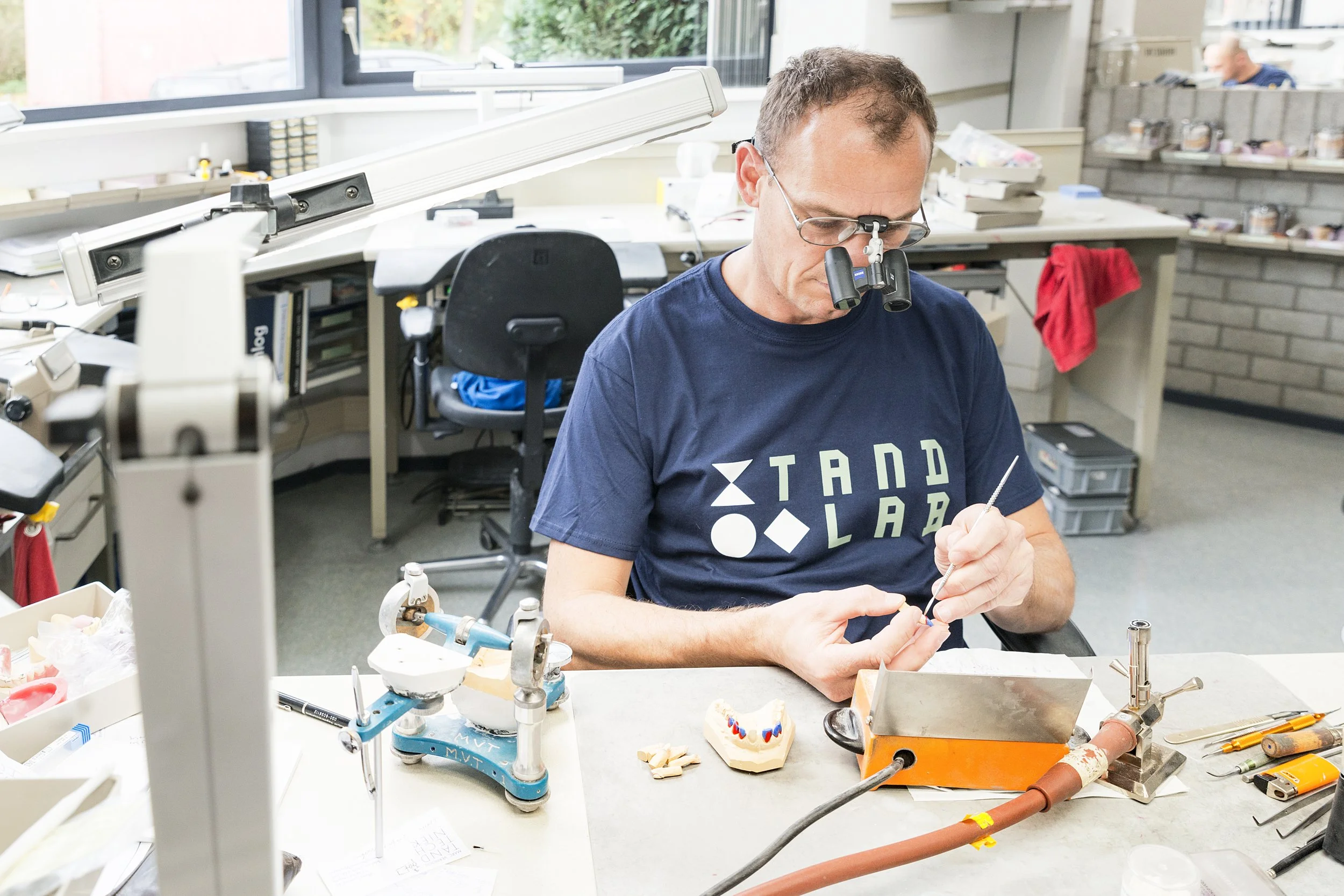
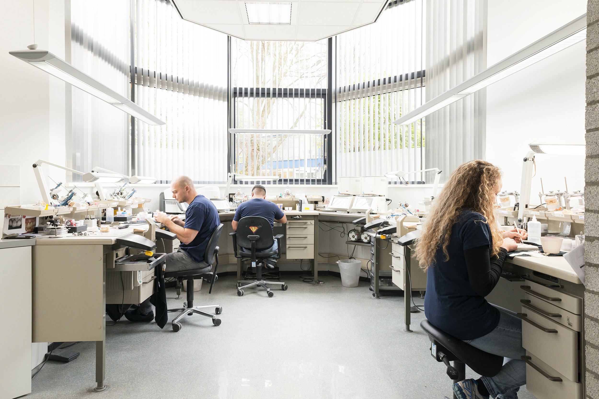
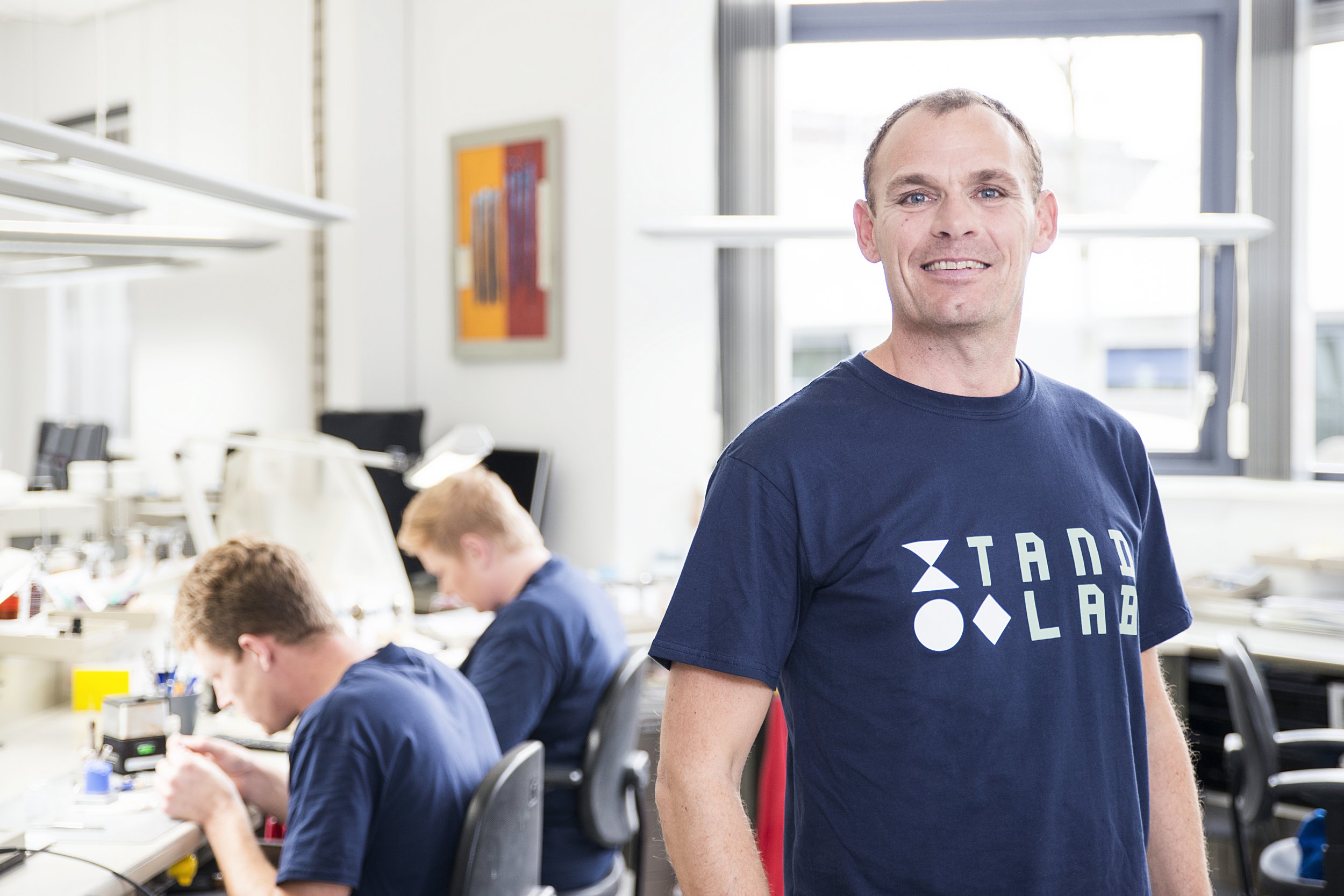
Tandlab is a laboratory for dental technology. They specialize in crown and bridge work and other dental prostheses. They cater to dentists and so they wanted to visually distinguish themselves from that sector. In a laboratory everything is very ordered. Everything follows a certain methodology. That's why the logo, design and wordmark are all strictly adhering to a grid. The custom typeface is similarly structured. The design language is based on the three dental shapes. Round, square and triangular. In their highly stylized form they is still recognizable for their customers: the dentists.
Client: Tandlab
Industry: Healthcare services
Assignment: Rebrand, Logo, Identity, Photography


Client
Tandlab
Worth mentioning
In opdracht van Creative Beards
Fotografie door Jeroen Berends
Questions about this project?
Ask Sjoerd
Sjoerd Wenting
Founder and art-director
Revolte Studio


