Modern brand identity for a company that aims for perfection
Client: TritonAudio
Industry: Audio hardware
Assignment: Branding, Logo, Identity, Copy, Product Video, Packaging
Goal: Customer retention and brand awareness
TritonAudio is a high-end audio hardware producer based in the Netherlands. These sound engineers started the company believing the audio equipment they used could be made better, and got to work. That practical attitude and passion for music and electronics has allowed the company to grow enormously in the last ten years. They sell their products worldwide, and doubled their production last year to meet the ever increasing demand.
The assignment
Initially we were asked to give the old logo a facelift. An update for readability, and to finally settle on a brand color. But our strategy session revealed there was a bigger problem to be solved.
They had one best-selling product: the FetHead. It is known far and wide in the worldwide audiogeek community. But those customers only knew the product name, not the brand name. A broader brand awareness, and therefore customer retention, was low. And so it was time to finally establish the company as a global brand. We advised a complete rebrand to raise brand awareness among their growing customer base. We did pay homage to a few key visual elements of the old logo to preserve the existing brand equity.
The story
TritonAudio’s position in their market is complex. They are a small operation with a large production volume. We positioned them as inventors, tinkerers, fellow audiophiles and sound engineers. All true. They are the kind of folks that only release a product if it is completely perfect. Down to the last detail. In addition, they are the original producers of the FetHead. The product that now has many cheaper, inferior copies.
This is TritonAudio
We are sound engineers, like you. When we need a product that’s not on the market, we set out to build it ourselves. If we find a product that can be improved, we will do so. And then, we like to share our inventions with our fellow tradesmen.
Each product is carefully designed, tested and assembled, right here in The Netherlands. We don’t believe in deadlines. We only release a product when it’s perfect.
All of our product are slimmed down to what you really need and only have features that truly enhance your music.
So rule the sound waves, with TritonAudio

Logo
The Art Deco inspired parallel lines have been taken from the old logo. We’ve put them to work to indicate the essence of TritonAudio: controlling signals. It brings the sound waves together, or, conversely, multiplies them. TritonAudio puts you in control of your sound. Rule the sound waves.
The diamond holding shape is also a leftover from the old logo. Same goes for the color - though freshened up a bit. This preserves the recognisability of your TritonAudio equipement in your sound studio. One of the biggest areas of improvement is the readability of the name. On the small tin shield that adorns all products, it was barely legible in the old logo. Having the name written over two lines in strong type gives it room to breathe.
Visual identity
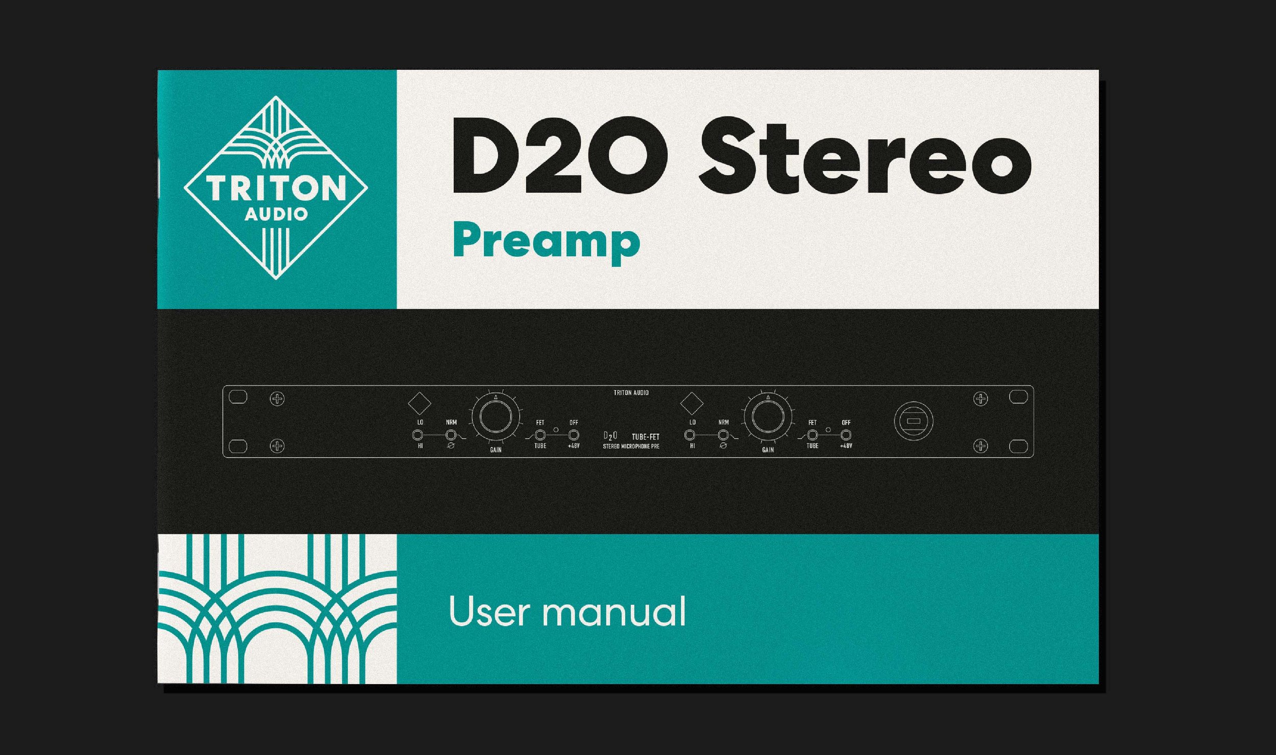
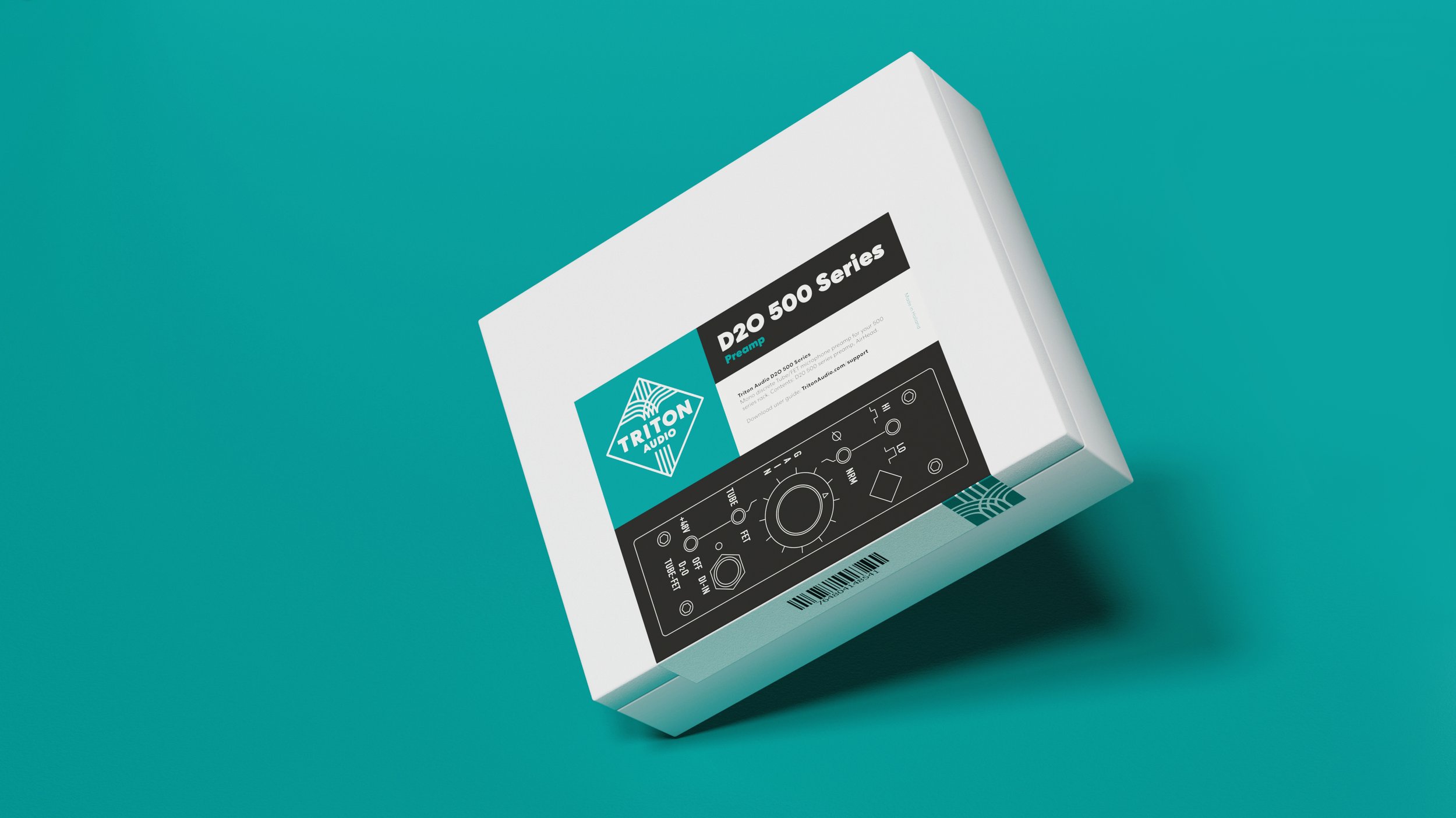
Brand recognition is all about consistent communication. Every customer touchpoint should reaffirm everything they know about you. TritonAudio’s products are mostly sold through resellers such as Thomann and Bax. So the customers don’t necessarily come to a brick-and-mortar store or their own website. That is why packaging has been an essential part of this rebrand. The signal lines, color scheme and typography are unmistakably TritonAudio when you receive your products. We showcase TritonAudio's technical background by putting a schematic drawing of the product on the packaging.
Client
TritonAudio
Worth mentioning
For this project we’ve collaborated with
Cyrion Willems - Director / Videographer / Cameraman
Nineyards Audio - Composition / Sound Design / VO recording
Questions about this project?
Ask Erik
Erik Ankoné
Founder / brand strategist
Revolte Studio


